
SHRINK WRAPPED
 These days, urban buildings are playing just one penny-whistle tune: glass, glass, glass. It’s as if there were a material shortage and we had run out of everything else. I don’t miss exposed concrete, but what about limestone and brick, terra cotta and granite? But no, architecture has been reduced to one material—even spandrels and soffits are glass. What explains this phenomenon? Well, of course it’s cheap. The engineer figures out the structure, and the architect wraps it in a glass skin. And the helpful glass manufacturers work out the details for you. It’s also easier to design. No more worrying about junctions between materials,
 In connection with the publication of
  I went to see the new National Museum of African American History and Culture, in Washington, D.C. The building isn’t open to the public yet so I could only see the exterior. Yet because of its location on the National Mall this is one building whose exterior appearance is key. It’s the last structure on the north side of the Mall, down the hill from the Washington Monument. From a distance, the museum has a nice scale and an evocative form. The corona shape has always seemed symbolically right to me, recalling both traditional Yoruba tribal art and a Brancusi sculpture.
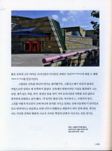 One reviewer of How Architecture Works suggested that readers should have a iPad handy when they read my book so that they could refer to images of the buildings that are mentioned in the text. The book has photos, but they are black and white, and not large, the usual format for a trade book. Now the publisher Mimesis has solved that problem. The Korean edition of the book is illustrated with beautiful color photographs, many taking a full page, and in some cases (Salk Institute, Centre Pompidou, Bilbao Guggenheim) a two-page spread. Mimesis is the art-book arm of Open Books,
 I recently watched an interesting
 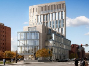 Campus buildings, if they were Classical in style, used to display their names in Roman lettering incised into the entablature; Collegiate Gothic buildings made do with medieval script. In either case the lettering was discreetly integrated with the architecture. No more. A growing trend in university buildings, especially high-rise buildings, is to display the name at billboard scale (thank you Robert Venturi). This started with medical buildings, but I have noticed other campus buildings sprouting overblown signs (the LeBow College of Business at Drexel is illustrated here). What drives this disturbing practice which gives university buildings the appearance of motels or casinos?