
FIRE IN THE CATHEDRAL
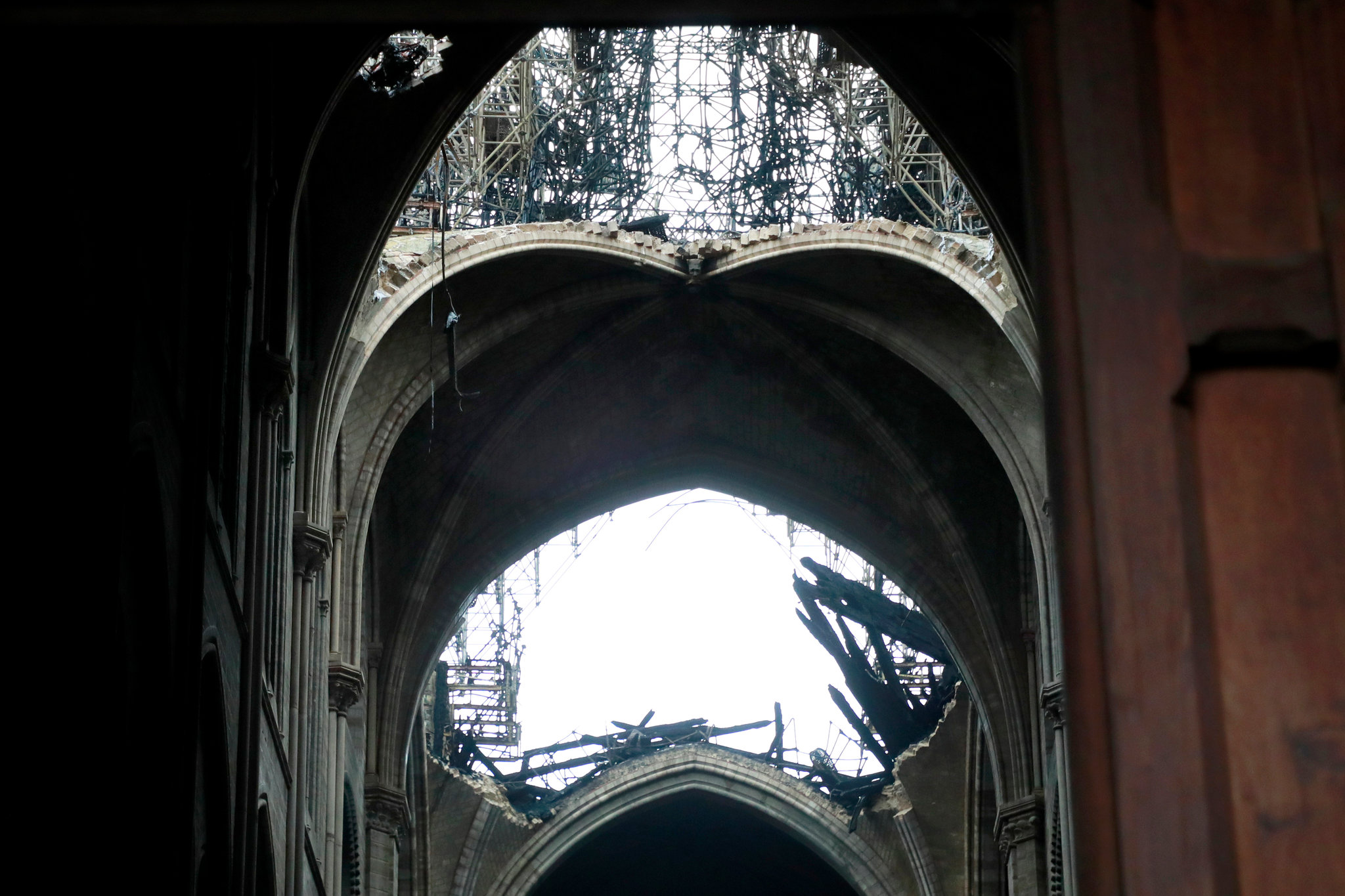
The heart-wrenching sight of Notre Dame de Paris in flames was a reminder that fire is the great enemy of architecture. So are earthquakes. The third enemy, ever since 1687 when the Venetians destroyed the Parthenon, is wartime bombardment. The Paris fire is also a reminder of what a weird hybrid structure Gothic cathedrals really are. The ancient Romans roofed their basilicas and baths with concrete vaults (the Pantheon with a dome), and the Byzantines used thin domes and vaults of brick. Over time, builders lost these skills and Romanesque cathedrals were roofed with exposed timber rafters like big barns. This made the buildings highly susceptible to fire, often caused by lightning strikes. The solution, pioneered at Durham Cathedral in the 11th century, was to build a lightweight ribbed stone vault over the nave. The timber roof remained, so the vault had no structural function (except to support itself) but it separated the interior from the flammable roof above. This was largely effective as the April 15 fire shows. However, news reports mention two “holes” in Notre Dame’s vaulted ceiling. This is misleading. As photographs (above) show, two large sections of the vaulted ceiling collapsed, unable to bear the weight of the falling debris.
LA LA LAND
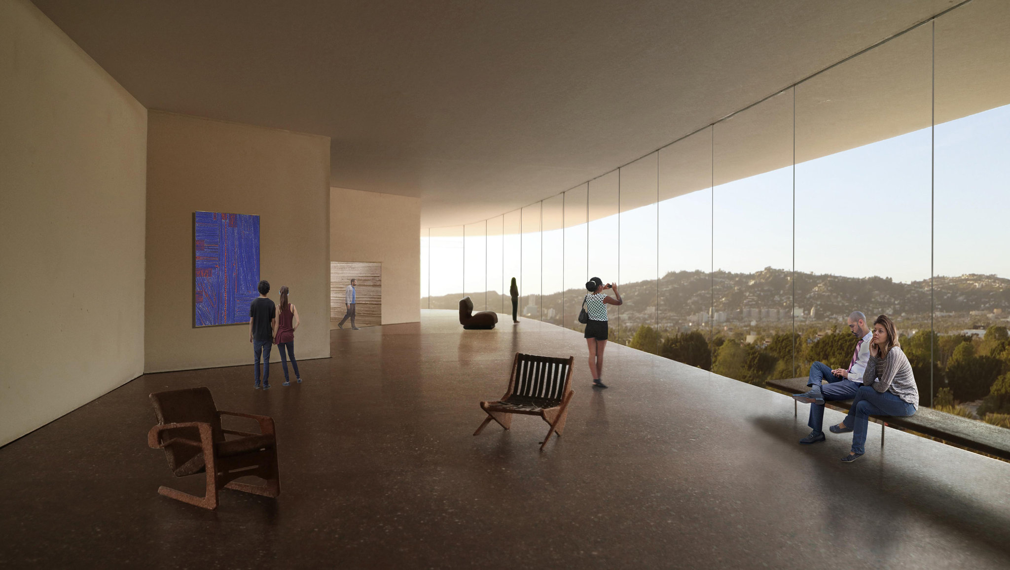
I have written crtically in Zócalo of LACMA’s decision to demolish its old museum. “Why does Los Angeles, which has little enough history, feel the need to keep reinventing its surroundings?” I asked. That was almost five years ago. Now we read that the LA county board of supervisors has finally given its approval and the new building will go ahead. I am not a fan of Peter Zumthor’s design. Apart from its rather simple-minded concept it does not look like it will be a sympathetic place to look at art. LACMA has not released any plans, but the views of the interior give the impression of an office lobby where the art is simply background wallpaper. Surely after Mies van der Rohe’s disastrous National Gallery in Berlin, we have learned that a glass-walled room is not a good setting for art? The rationale seems to be that old chestnut, flexibility. LACMA director Michael Govan is quoted by the New York Times as saying that the new museum will create spaces that are “good for different kinds of art.” Looking at the slow evolution of Zumthor’s design, now black now white, now blobby now zigzaggy,

THE TRANSPARENCY TRAP
Blair Kamin, the architecture critic of the Chicago Tribune, recently made this wise observation about the latest crop of urban buildings: “Glass usually works best when it operates in counterpoint to richly articulated walls of masonry. When glass becomes the context, it often struggles to match the quality and character of limestone, granite, brick and terra cotta.” In other words, the first generation of all-glass buildings benefitted from their masonry neighbors (Pei’s John Hancock Tower, across from Richardson’s Trinity Church comes to mind). Today, not so much. Our downtowns are dominated by all-glass boxes, even cities like Washington, D.C. (once marble and limestone) and Philadelphia (once brick and limestone). Le Corbusier described (modernist) architecture as “the masterly, correct and magnificent play of volumes brought together in light.” Corbusier used glass but he never designed all-glass buildings. Neither did Mies; he added superfluous I-beams to his facades (which also had substantial spandrels). The problem with transparent glass is that it doesn’t hold a shadow, and without a shadow there can be no “play of volumes.” Since minimalist modernist architecture doesn’t offer decoration or ornament, that doesn’t leave much to look at.
ROCK CENTER REDUX
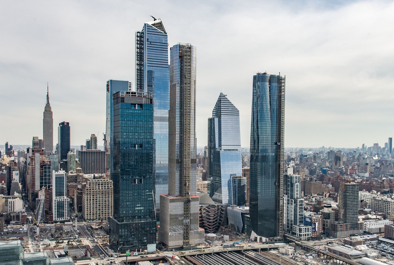
There have been a number of articles about the new Hudson Yards project in New York: Michael Kimmelman in the New York Times, Michael J. Lewis in the Wall Street Journal, Alexandra Schwartz in the New Yorker. Schwartz is forthright: “what Hudson Yards really feels like is a nice airport terminal, with the High Line as its moving walkway.” Lewis likes the observation deck of the tallest skyscraper. Kimmelman doesn’t say much about the architecture but like Lewis he points out the paucity of urban design in the master plan, and both compare it unfavorably to Rockefeller Center. Fred Bernstein in Metropolis has some interesting views on why this might be so. But none of the critics talks about how downright ugly this assemblage of high-rise buildings is on the city’s skyline. (Is that why they generally avoid mentioning the individual architects? They are: Numbers 10 & 30, KPF; 15, Diller Scofidio + Renfro; 35, SOM; 50, Foster + Partners; 55, KPF and Roche Dinkeloo.) The buildings are all-glass, of course. Some of the buildings are odd-shaped, some are rectangular, some tops are flat, some are angular,

WHY THE FRENCH LIKE MODERN DESIGN
Watching the French television political soap Marseille—but anything with Gérard Depardieu can’t be all bad—I was struck, again, by how much the French like modern design. The furniture in the scenes was inevitably modernist, more so than would be the case in Madame Secretary, say. Then it struck me that while the furniture was aggressively modern, most of the background architecture was not. The Marseille city hall, for example, is a beautiful seventeenth-century building; Depardieu’s home (he plays the mayor, of course) is a fin-de-siècle villa. In one episode, a hospital room filled with the latest medical gadgetry in a private clinic, is actually a paneled tall-ceilinged repurposed salon. I guess you want something new when you have something old to put it in. Incidentally, the most noticeable modern buildings in Marseille are the faceless apartment slabs in the low-cost housing projects. They are cleaner and better maintained than their American counterparts, but otherwise, as the story makes clear, they are just as dehumanizing.

THE GEHRY TOUCH
Last October the Philadelphia Museum of Art re-opened its restaurant. It is designed by Frank Gehry, whose firm is doing a major do-over of the museum. I thought I should take a look and we went there for lunch. The small (75 seats) restaurant, somewhat mysteriously titled Stir, is inauspiciously located behind a frosted glass wall off a banal corridor—hardly an elegant setting. The PMA describes the restaurant decor as having an “ebullient Gehry touch.” I suppose that is a reference to the heavy trellis made of curved laminated Douglas fir beams that is suspended in the middle of the room like some sort of woodsy Calder mobile. There is not much evidence of ebullience elsewhere. The walls and ceiling are paneled in Douglas fir plywood, the floor is red oak. Wood is generally considered to be warm, but the way Gehry handles it, without detail or indeed any sign of human craft, is curiously utilitarian, and the overall effect is more like a high-school cafeteria than a museum dining room. Incidentally, all those hard surfaces, as well as the open kitchen (I can’t wait for that fad to pass) make for a very noisy room. Lack of ambience aside,