DOM
 The Cracow publisher, Karakter, has re-issued a Polish translation of Home. This is the thirteenth foreign edition of the book, which originally appeared in 1986. The Polish translation was the work of my late aunt, Krystyna Husarska.
CATEGORY I AND CATEGORY II
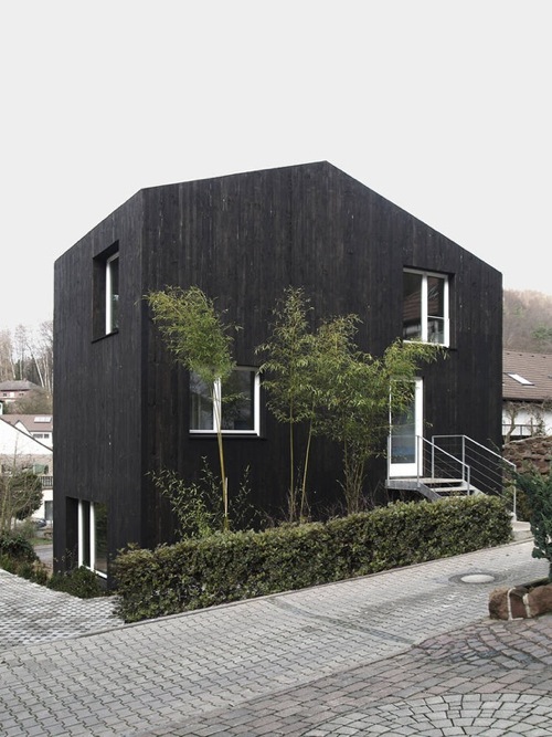
Category II (Kaiserslauten, GDR, 2011)
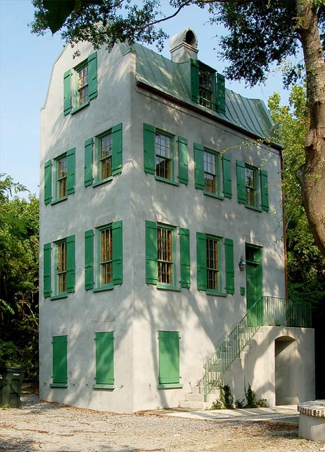
Category I (Charleston, 2009)
You can divide residential architects into two categories: those who design for their clients, and those who design for their colleagues. When the work of Category I is published, it is in mass market magazines such as Architectural Digest and Elle Decor; the work of Category II appears in professional journals and architectural monographs. These are read by architecture students, which may be why Category IIers tend to be invited to teach. Another reason is that Category II is interested in originality and innovation, which attracts tyros. In truth, the innovation is rather narrow: note the current popularity of black-stained wood, skinny columns, and prefabrication. Category I architects are more concerned with what has worked in the past, which makes their work more traditional, although the range encompasses regionalism, vernacular styles, and eclecticism.
The situation in institutional and commercial building is different. It would be almost impossible for a Category I architect to win an international competition for a library, museum, or concert hall today. In commercial buildings, Category II architects likewise dominate since the media and marketing privilege the new-new thing. A Category I architect must count on the (rare) cases of exceptional patrons (college presidents, corporate CEOs) who are prepared to buck fashion and take the longer view.
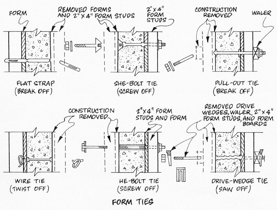
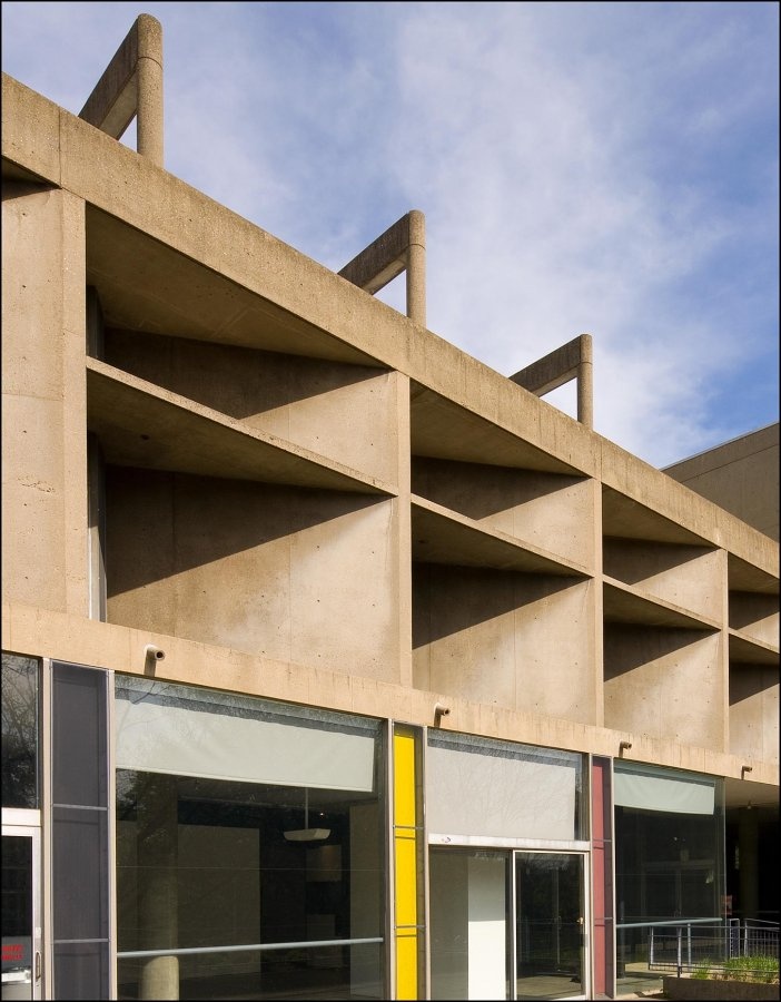
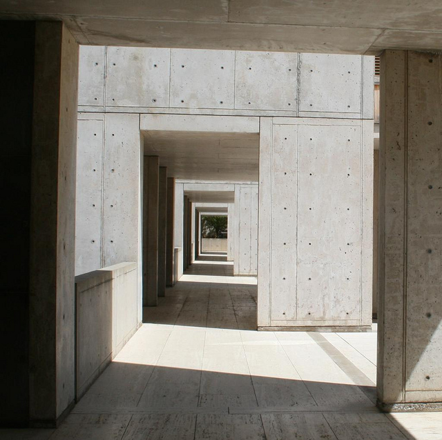
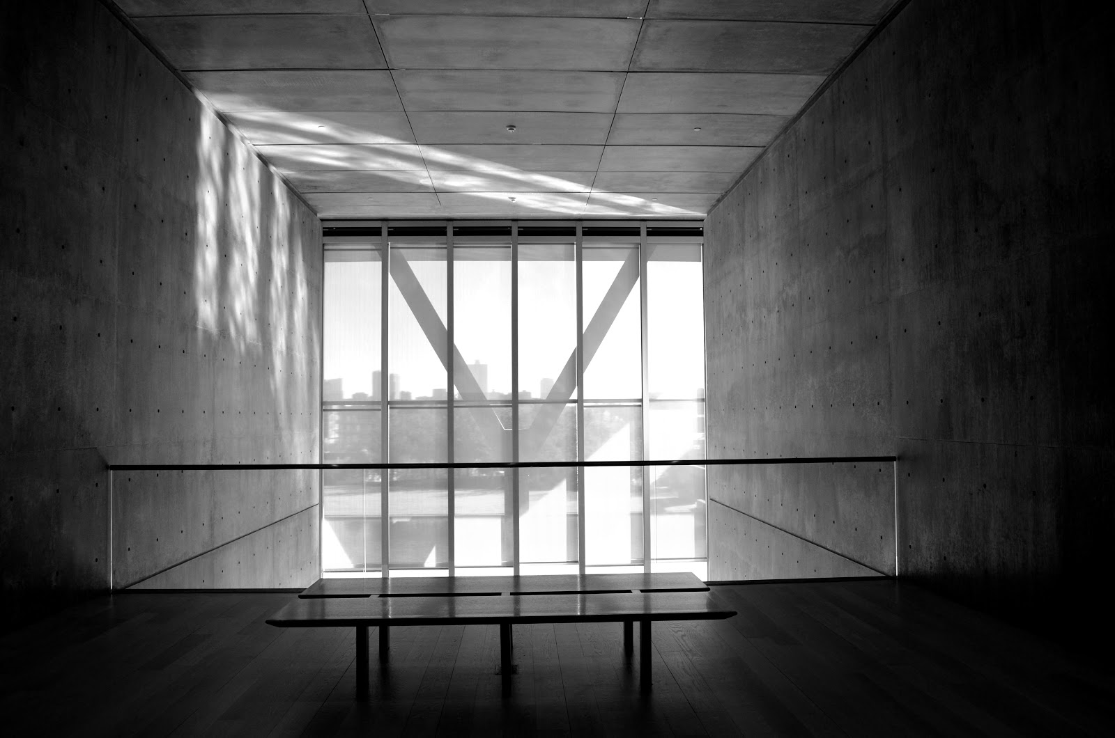
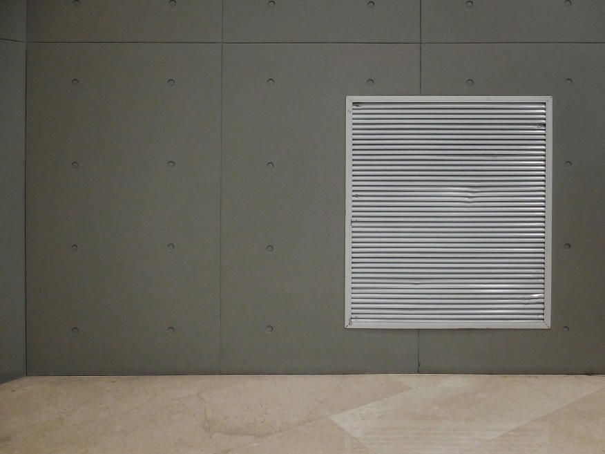
THE FORM TIE DETAIL
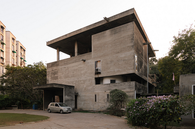
Shodhan house
Corbusier was the first architect to use cast-in-place concrete as exterior (and interior) cladding, probably in the Unité d’habitation (1946-62) in Marseilles. The Unité was actually hybrid construction, consisting of cast-in place and precast concrete as well as a steel frame. By the time he built the Shodhan house (1956) in Ahmedabad, he was using exposed cast-in-place concrete throughout. Concrete formwork must be designed to resist the pressure of the heavy concrete until it sets. The cheapest way to do this is to use form ties—wire ties that hold the two pieces of formwork together; the wire is snipped off after the form is removed, and the wire ends—which will rust—are patched over. Unsightly but Le Corbusier didn’t care—he liked the rough and ready appearance of béton brut.
Carpenter Center
Salk Institute
The Carpenter Center (1961-64) at Harvard was likewise cast in place, but the ties were treated differently. Instead of a patch, the ties had a throwaway plastic insert that allowed the patch to be less obvious. The ties were regularly spaced in a roughly 2’ x 2’ grid. The Carpenter Center has a more finished appearance than Shodhan, probably due to Josep Lluís Sert, who supervised the construction and was likely also responsible for the form-tie detail. The plastic insert must have been a manufacturer’s invention—sometime in the late 1950s—although I have not been able to identify the maker. Louis Kahn popularized the insert in the Salk Institute (1959-65). He made the holes more prominent by sinking them deeper and plugging them with lead. Otherise the concrete was left in its natural state.
Ft Worth Art Museum
Shanghai Natural History Museum
Concrete is actually not a very good material for cladding since it is porous and prone to spalling, cracking, and chipping. By the 1980s, architects were more likely to use stone or brick veneer, and increasingly glass curtain walls. With the reemergence of orthodox modernism, architects such as Tadao Ando revived concrete cladding, both inside and out. Ando, who admired Kahn, also revived the form-tie detail. It is plainly visible in the Fort Worth Art Museum. What is not obvious is that since fewer ties are now required, only some of the holes are real ties—the rest are counterfeit. In fact, it is possible to dispense with form ties altogether and produce perfectly smooth unmarked concrete walls, as Renzo Piano did in the galleries of his addition to the Kimbell. Perhaps the oddest form-tie detail is in the Shanghai Natural History Museum (2015), designed by Perkins & Will. On the interior, next to an actual cast-in-place concrete wall, is a partition of plaster wallboard, with a pattern simulating concrete ties. As often happens in architecture, constructional necessity has mutated into pure decoration.
BAD NEWS, GOOD NEWS
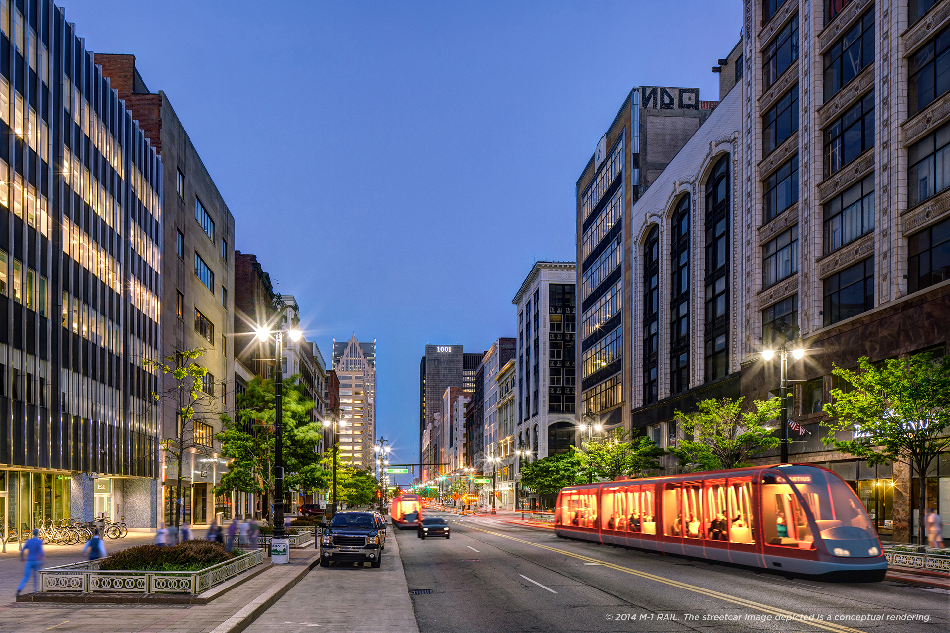 I just came across an advertisement from JP Morgan Chase in the Atlantic. “What the rebuilding of Detroit can teach us” was the tag line. What caught my eye was the accompanying photograph of a downtown scene with a futuristic-looking streetcar rolling down the street. It looked like one of those hi-tech jobs one sees in German or Swiss cities. A closer look at the small type revealed that this was a “rendering,” what used to be called an “artist’s conception,” before PhotoShop made such images entirely lifelike. The so-called M1 line is currently under construction; it will run all of 3.3 miles. At least that’s longer than the often-ridiculed People Mover, the elevated and automated train that circulates downtown, largely empty. The flood of comeback stories about troubled Detroit reminds me of the reporting about New Orleans after Katrina. Both follow a formula: first the bad news, then the good news—rebuilding, recovery, renaissance. We’ve been there before: Detroit’s Renaissance Center dates from 1977.
YO MAMMA
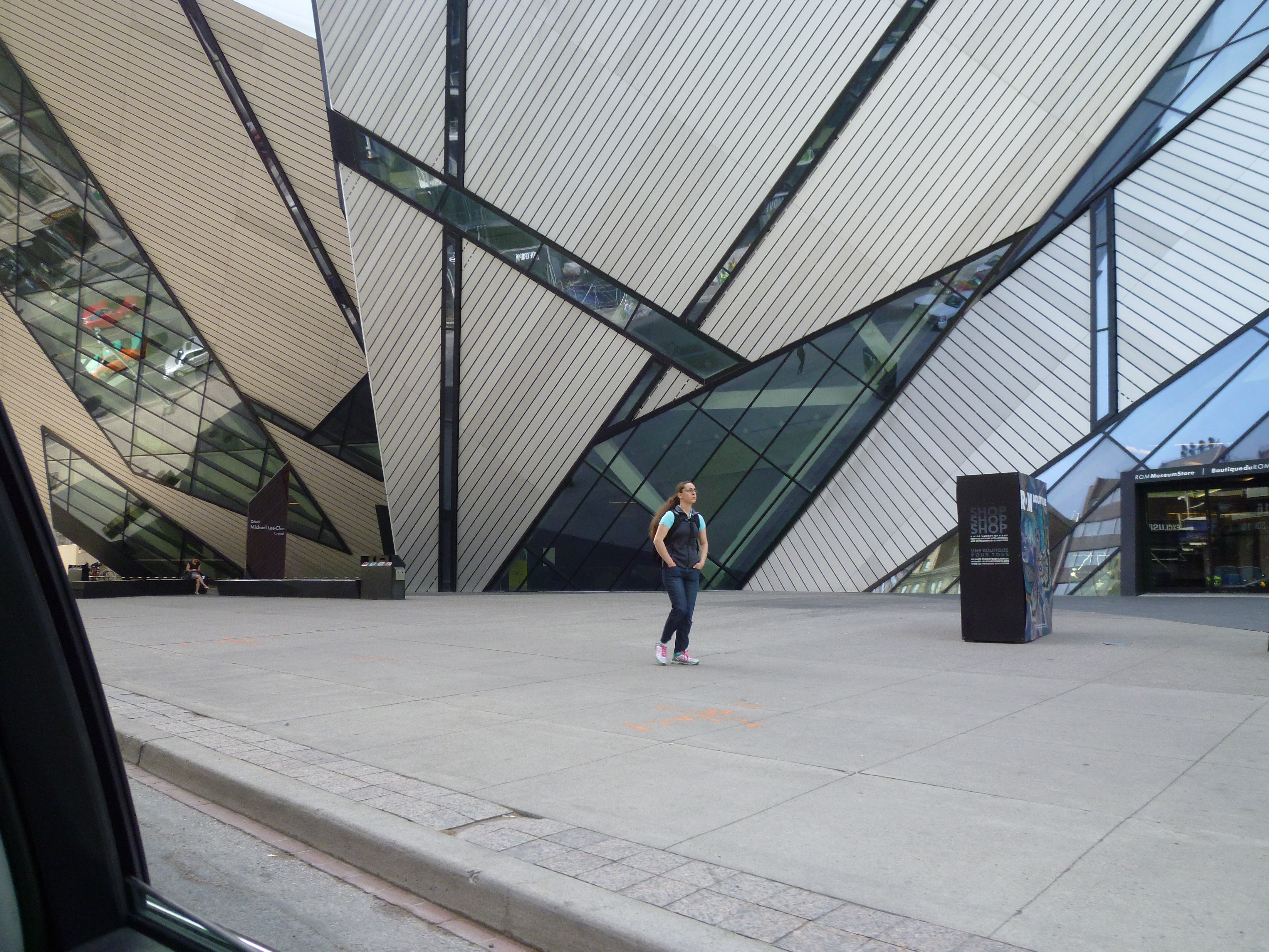 Vitruvius called architecture the mother of the arts. He meant that it encompassed the other arts—both physically, as in temple architecture, and chronologically. I think that the maternal analogy was also meant to distance architecture from its more exuberant offspring, painting and sculpture; “mother” implied a certain reserve and gravitas. Today, as Peter Buchanan writes in Architectural Review, the mother of the arts “has become reduced to superfluous spectacle.” A few days ago I saw Daniel Libeskind’s addition to the Royal Ontario Museum in Toronto. “The Crystal” summons up images of delicate transparency, instead this clumsy construction looms over the sidewalk like an alien being, in the city but not part of it. It’s not much of a spectacle, either. The young woman walking by stares ahead, seemingly intent on ignoring this embarrassing architectural screamer.
FOREVER YOUNG
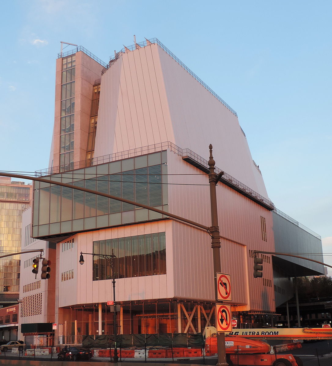
Photo: Jim Henderson
Many critics have commented on the disconnect between the exterior and the interior of the new Whitney Museum of American Art. But only an article in the current issue of TIME (read in my doctor’s waiting room) points out the obvious connection between the Whitney and the Centre Pompidou. Over the decades, Renzo Piano has produced so many sedate, restrained and above all polite museums that it is easy to forget that his first effort was raucous, immoderate, and (urbanistically) ill-mannered. It also wasn’t really a very good museum. Piano has since learned how to design successful galleries, but in the Whitney the 77-year-old architect seems to have returned to his youthful enthusiasms. Whether he was inspired by the Chelsea surroundings, or more likely decided to confound his critics by producing something unpredictable, is anyone’s guess. The Whitney dispenses with exposed plumbing—that was never a good idea—but it has some of the same bad boy demeanor of the Pompidou. You say you don’t like me? Ta gueule!
SKETCHES OF SPAIN
Travel sketches: Spring 1967.

Molino, Formentera

San Francisco, Formentera
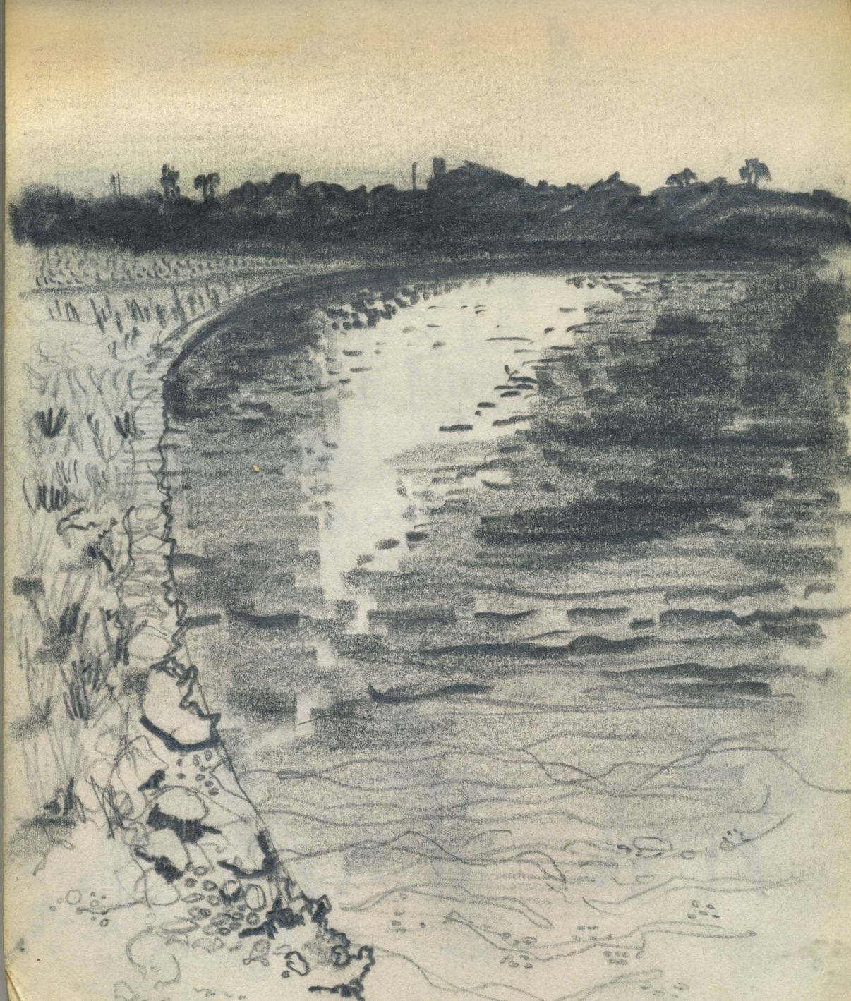
Salinas, Formentera
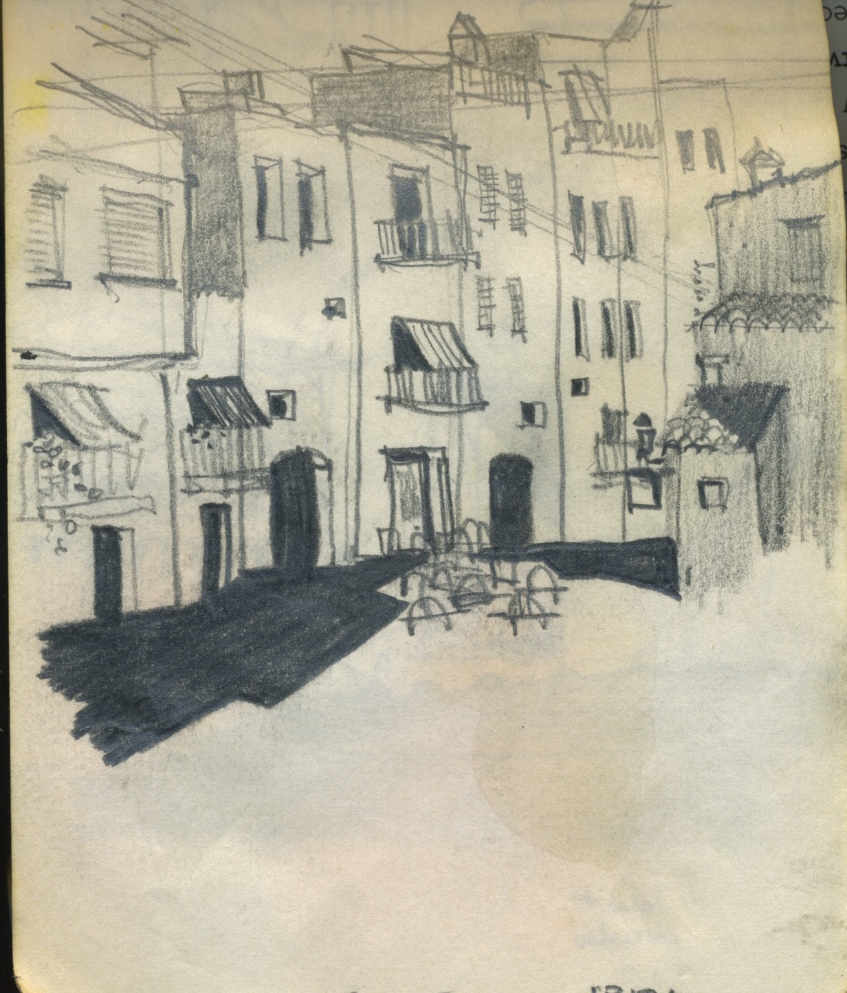
Ibiza

Valencia
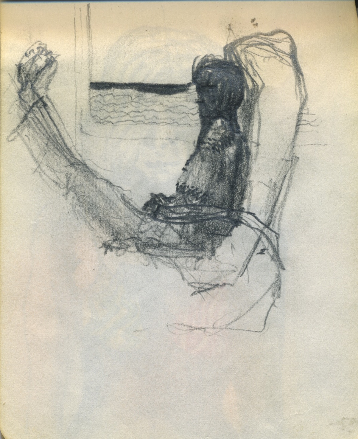
Valencia-Paris train
FAUX
 “There’s nothing wrong with replicating old architecture,” George Lucas said, reacting to criticisms of his proposed Museum of Narrative Art for the Presidio in San Francisco. “Basically all of Washington is a mimic of the past.” As is well known, Lucas’s proposal was turned down, and the museum is going to be built in Chicago instead. Many felt that the Presidio building was too large for its site, which is likely true, but there was also resistance to the architectural style, which was usually characterized as “faux Beaux Arts.” The adjective is a dead giveaway; no one ever called Philip Johnson’s Glass House “faux Mies,” or Richard Meier’s early houses “faux Le Corbusier.” The Lucas Museum was the work of EHHD, responsible for such Bay Area landmarks as the Monterey Bay Aquarium and the Exploratorium on the San Francisco waterfront. The founder of EHHD was the eminent modernist Joseph Esherick, and the firm is not known for classical work, so perhaps its heart wasn’t in it. But looking at the rendering of the Lucas museum, it strikes me that this was not the kind of Beaux-Arts building that Arthur Brown, Jr., or even Bernard Maybeck, might have designed. The colonnade appears to be supported not by columns but by caryatids, recalling Michael Graves’s Seven Dwarfs caryatids at the Team Disney Building. It’s hard to make out, but presumably they represent Star Wars characters, or references to other fictional figures. Lucas’s quirky collection—Norman Rockwell and N. C. Wyeth paintings, Flash Gordon strips, Mad magazine cartoons, movie props, Yoda models—deserves an eccentric and unpredictable building (although more refined than this rather clumsy effort). Instead, judging from the drawing released by MAD Architects of Beijing, the Lucas Museum in Chicago will be predictable: faux Eric Mendelsohn.
MAKESHIFT METROPOLIS
 Owl Publishing House in Taipei has just issued a translation of Makeshift Metropolis: Ideas About Cities. The book has also been translated into Russian (Strelka Press, Moscow) and will soon be available from Commercial Press of Beijing. Translations of Home and One Good Turn are also available from Owl.
THE MILLE-FEUILLE EFFECT
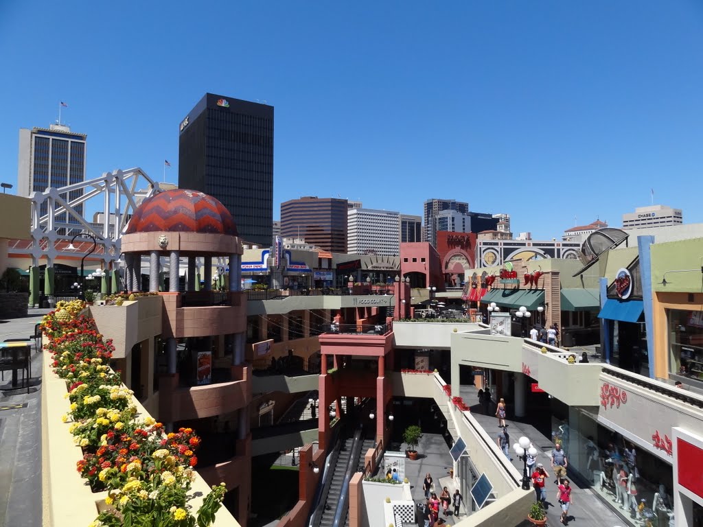
Horton Plaza, San Diego
Writing about the late Jon Jerde in a recent issue of Architect, Karrie Jacobs brought me up short with a wonderfully pithy phrase. She described a Jerde-designed project as “a mille-feuille of the simulated and the real, layer upon layer upon layer.” Exactly. I remember visiting the newly-built Horton Plaza in San Diego, an urban shopping mall that Jerde designed in 1985. My first reaction was revulsion—this was postmodernism on steroids, cliché piled upon cliché. But then the Mille-Feuille Effect kicked in. The stagey architecture was obviously fake, but the sun and fresh air were real (the public spaces were not roofed). The ersatz arches and polychromy were artificial, yet the views of downtown buildings were real enough—this was one mall that was was not hermetically sealed off from its surroundings. And of course the people who were clearly enjoying themselves in this architectural jungle gym were real, too.
THE LATEST
