THE TRANSPARENCY TRAP
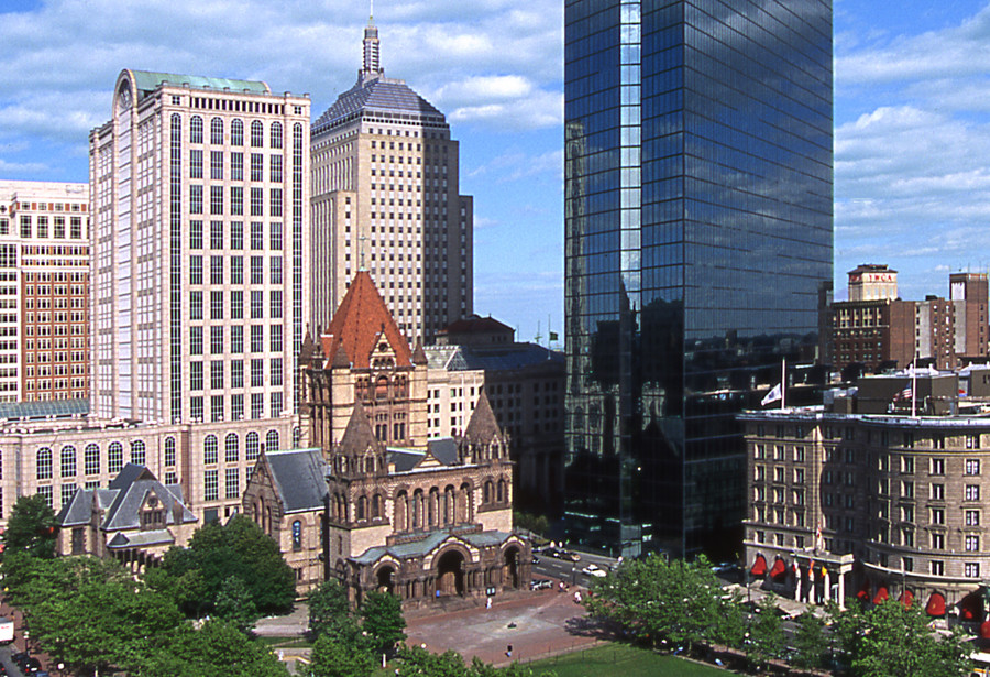
Blair Kamin, the architecture critic of the Chicago Tribune, recently made this wise observation about the latest crop of urban buildings: “Glass usually works best when it operates in counterpoint to richly articulated walls of masonry. When glass becomes the context, it often struggles to match the quality and character of limestone, granite, brick and terra cotta.” In other words, the first generation of all-glass buildings benefitted from their masonry neighbors (Pei’s John Hancock Tower, across from Richardson’s Trinity Church comes to mind). Today, not so much. Our downtowns are dominated by all-glass boxes, even cities like Washington, D.C. (once marble and limestone) and Philadelphia (once brick and limestone). Le Corbusier described (modernist) architecture as “the masterly, correct and magnificent play of volumes brought together in light.” Corbusier used glass but he never designed all-glass buildings. Neither did Mies; he added superfluous I-beams to his facades (which also had substantial spandrels). The problem with transparent glass is that it doesn’t hold a shadow, and without a shadow there can be no “play of volumes.” Since minimalist modernist architecture doesn’t offer decoration or ornament, that doesn’t leave much to look at.
ROCK CENTER REDUX
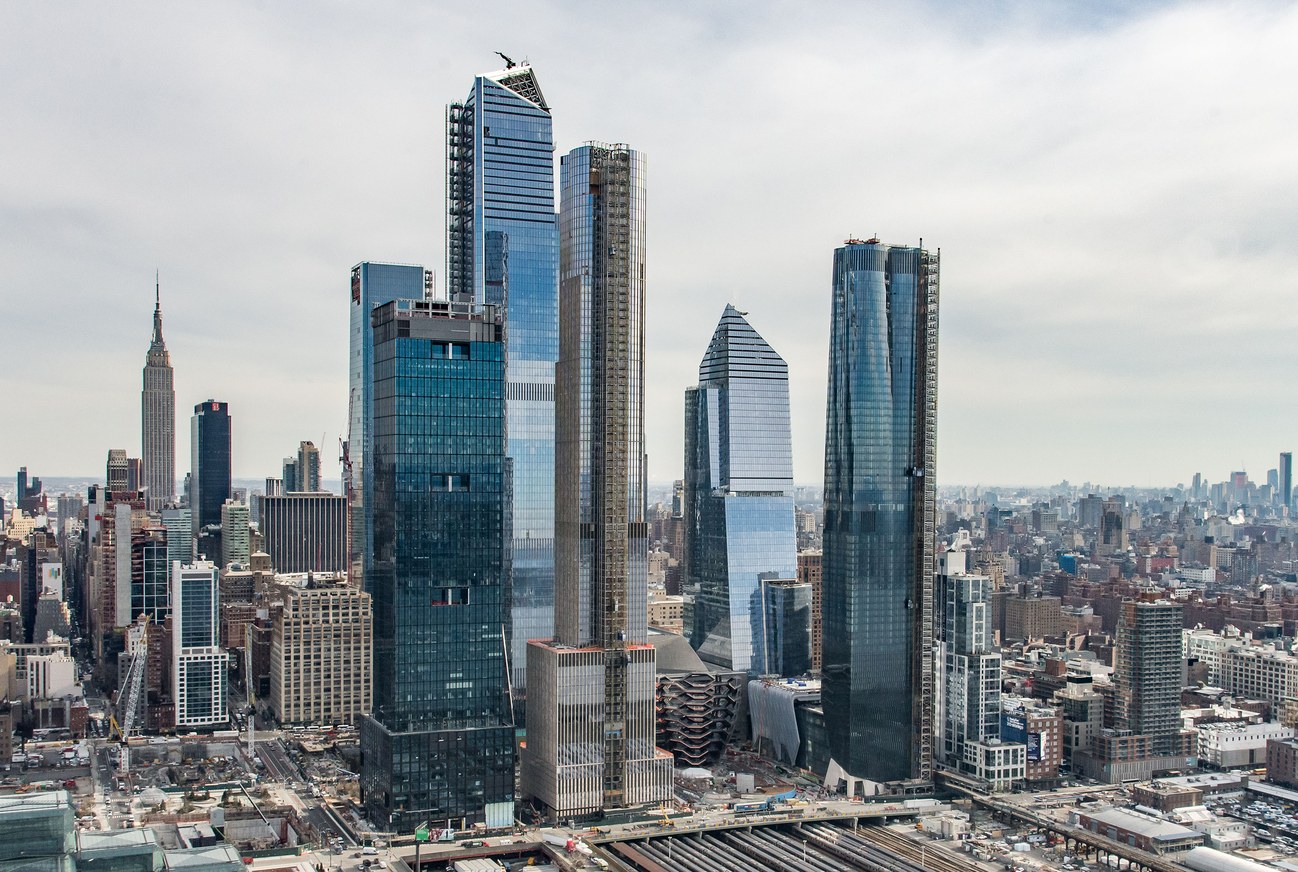
There have been a number of articles about the new Hudson Yards project in New York: Michael Kimmelman in the New York Times, Michael J. Lewis in the Wall Street Journal, Alexandra Schwartz in the New Yorker. Schwartz is forthright: “what Hudson Yards really feels like is a nice airport terminal, with the High Line as its moving walkway.” Lewis likes the observation deck of the tallest skyscraper. Kimmelman doesn’t say much about the architecture but like Lewis he points out the paucity of urban design in the master plan, and both compare it unfavorably to Rockefeller Center. Fred Bernstein in Metropolis has some interesting views on why this might be so. But none of the critics talks about how downright ugly this assemblage of high-rise buildings is on the city’s skyline. (Is that why they generally avoid mentioning the individual architects? They are: Numbers 10 & 30, KPF; 15, Diller Scofidio + Renfro; 35, SOM; 50, Foster + Partners; 55, KPF and Roche Dinkeloo.) The buildings are all-glass, of course. Some of the buildings are odd-shaped, some are rectangular, some tops are flat, some are angular, but the whole thing adds up to—well, nothing, really. These buildings are like a group of self-engrossed millennials, posturing, taking selfies, ignoring each other and their surroundings. Poor New York.

WHY THE FRENCH LIKE MODERN DESIGN
Watching the French television political soap Marseille—but anything with Gérard Depardieu can’t be all bad—I was struck, again, by how much the French like modern design. The furniture in the scenes was inevitably modernist, more so than would be the case in Madame Secretary, say. Then it struck me that while the furniture was aggressively modern, most of the background architecture was not. The Marseille city hall, for example, is a beautiful seventeenth-century building; Depardieu’s home (he plays the mayor, of course) is a fin-de-siècle villa. In one episode, a hospital room filled with the latest medical gadgetry in a private clinic, is actually a paneled tall-ceilinged repurposed salon. I guess you want something new when you have something old to put it in. Incidentally, the most noticeable modern buildings in Marseille are the faceless apartment slabs in the low-cost housing projects. They are cleaner and better maintained than their American counterparts, but otherwise, as the story makes clear, they are just as dehumanizing.
THE GEHRY TOUCH
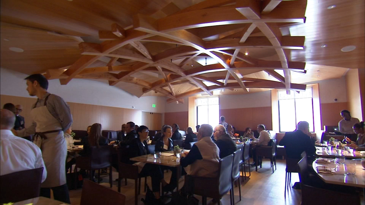
Last October the Philadelphia Museum of Art re-opened its restaurant. It is designed by Frank Gehry, whose firm is doing a major do-over of the museum. I thought I should take a look and we went there for lunch. The small (75 seats) restaurant, somewhat mysteriously titled Stir, is inauspiciously located behind a frosted glass wall off a banal corridor—hardly an elegant setting. The PMA describes the restaurant decor as having an “ebullient Gehry touch.” I suppose that is a reference to the heavy trellis made of curved laminated Douglas fir beams that is suspended in the middle of the room like some sort of woodsy Calder mobile. There is not much evidence of ebullience elsewhere. The walls and ceiling are paneled in Douglas fir plywood, the floor is red oak. Wood is generally considered to be warm, but the way Gehry handles it, without detail or indeed any sign of human craft, is curiously utilitarian, and the overall effect is more like a high-school cafeteria than a museum dining room. Incidentally, all those hard surfaces, as well as the open kitchen (I can’t wait for that fad to pass) make for a very noisy room. Lack of ambience aside, we had a nice lunch. The service was shaky, but that may be opening jitters. The food was excellent.

FRUITCAKE
What is it with Americans and fruitcakes? For many years we used to throw an annual midday New Year’s Day party. Bloody Marys, big buffet table, Niman Ranch ham, stuff like that. People seemed to enjoy the food, but we noticed that there was usually leftover fruitcake. We were puzzled why there were so few takers, because we had gone to a lot of trouble to order this particular confection from Vermont. Perhaps because we came from Canada, where fruitcake—dark, moist, and rich—is a Christmas tradition, we didn’t know that to Americans fruitcake was associated with a different tradition. According to Wiki, “the fruitcake had been a butt of jokes on television programs such as Father Knows Best and The Donna Reed Show . . . and appears to have first become a vilified confection in the early 20th century, as evidenced by Warner Brothers cartoons.” According to Wiki again, there is a town in Colorado that hosts something called the Great Fruitcake Toss on the first Saturday of every January, using recycled—that is, uneaten—fruitcakes. No wonder so many of our guests gave our fruitcake a pass. We stuck to our guns and continued to serve fruitcake (with cheese, a Yorkshire custom) but we didn’t make many converts.
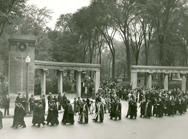
LOOKING NORTH
I attended McGill University, which is sometimes described as “the Harvard of the North.” After reading Ross Douthat’s column on the Ivy League in today’s New York Times, it’s evident that it really isn’t—or at least wasn’t when I was there. One difference is that Canadian students didn’t “go away to college,” they simply attended whatever university was near to where they lived. Thus, most of my architecture classmates—all men—were Montrealers. Unlike Ivy League campuses today, which are awash with monogrammed sweatshirts and caps, we didn’t show off our affiliation—actually we didn’t wear sweat shirts, rather jackets and ties, and in the 1960s the annoying fashion for baseball caps had not yet taken hold. Another difference was that Canadian university tuition was not exorbitantly high. (The very wealthy had the option of sending their kids to the US.) Thus, my classmates were resolutely middle-class, mostly WASPs, a handful of Jewish Montrealers, a sprinkling of immigrant kids like myself, and a token French Canadian (they tended to go to the Université de Montréal). Did I drink? Yes, a lot, at least in the early years; late nights in the architecture studio eventually put a crimp into that activity. McGill had fraternities, and a few of my friends belonged—I was rushed but dropped out—I am not a big joiner. Few if any of my classmates attended the Canadian equivalent of American prep schools; perhaps preppies weren’t attracted to architecture? I went to a private Jesuit boys school in Montreal, but Loyola was hardly a prep school. Its chief clientele, English-speaking Montreal Catholics, tended to be of Irish or Italian heritage, the descendants of blue-collar workers (rich WASP kids went to Lower Canada College or Bishop’s), and the richest Loyola boys I recall were from the Dominican Republic and South America.

IN THE CORNER WITH MAURY
Richard Terrill recounts a wonderful story in “Who Was Bill Evans?”
Jazz bandleader Stan Kenton told a story about himself as a kid, trying to sneak into a Paris club to hear jazz. He was too young to drink, even in France. The concierge finally said, ok, just go sit in the corner with that old man. His name is Maury.
And it went like this for several evenings. Go sit in the corner with Maury, kid.
Years later, Kenton learned that the old man had been Maurice Ravel.
POP GOES THE WEASEL
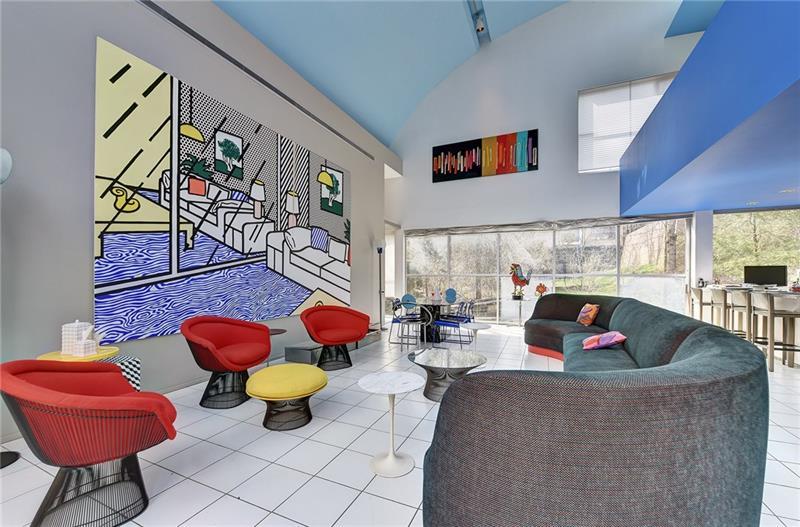
News that the Abrams House in Pittsburgh, designed by Venturi, Rauch and Scott Brown in 1979, has been sold and is to be demolished. Apparently, the new owner, who lives in the adjacent Giovannitti House (designed by Richard Meier) wants to enlarge his garden—the original owner of the Giovannitti House had sold the back part of his lot to the Abrams. Or maybe he just wanted to get rid of an eyesore? Venturi’s postmodern antics do not age particularly well. I was struck by the presence of a large (looks to be about 8 feet by 12 feet) painting by Roy Lichtenstein in the Abrams living room. Lichtenstein (1923-97), was the premier Pop artists of that epoch; a painting of his sold in 2011 for a record $43 million. I assume that the Pittsburgh Lichtenstein was not included in the house sale, which netted a paltry $1.1 million. Apparently Pop art is more in demand than Pop architecture.
A CALM IN THE STORM
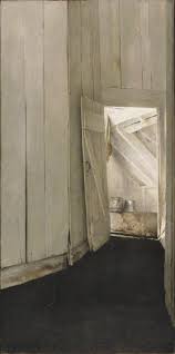
“Modernism wasn’t just a style—it was a way of thinking, a way of life,” expounds Jessica Todd Smith in a video on the Philadelphia Museum of Art website. Smith, who is the curator of the current PMA show, “Modern Times: American Art 1910-1950” (on view until September 3), also refers to the “beautiful chaos of innovation.” Those four decades were, indeed, chaotic: two world wars, the Soviet revolution, the Great Depression, social upheavals, the emergence of mass production and the consumer society. Where did this stormy time leave the artist? Adrift, judging from this show. Museums don’t pipe-in music (except in the gift shop), but if they did Cole Porter’s “Anything Goes” (from a 1932 musical of the same name) would be perfect. Innovation was the order of the day: Calder’s wire mobiles, O’Keefe’s enlarged lilies, Pollock’s frenetic daubing. “The world’s gone mad today. And good’s bad today.” It’s a relief to come across Horace Pippin’s calm portrait of Christian Brinton (1940), a supportive art critic. Calm, too, are Edward Hopper’s studies for his etching, American Landscape (1920). The work of photographers tends to be likewise distinctly un-frenetic, perhaps because shooting (especially with a large format camera), developing, and printing, require unruffled concentration. I particularly liked Paul Strand’s famous Wall Street, New York (1915). But the calmest work to me was a small (13” x 25”) tempura panel, Andrew Wyeth’s Cooling Shed. Painted in 1953, it barely makes the cut in more ways than one. “If modernism is a way of life, I will have none of it,” the little painting seems to say.
PAPER BLINKERS
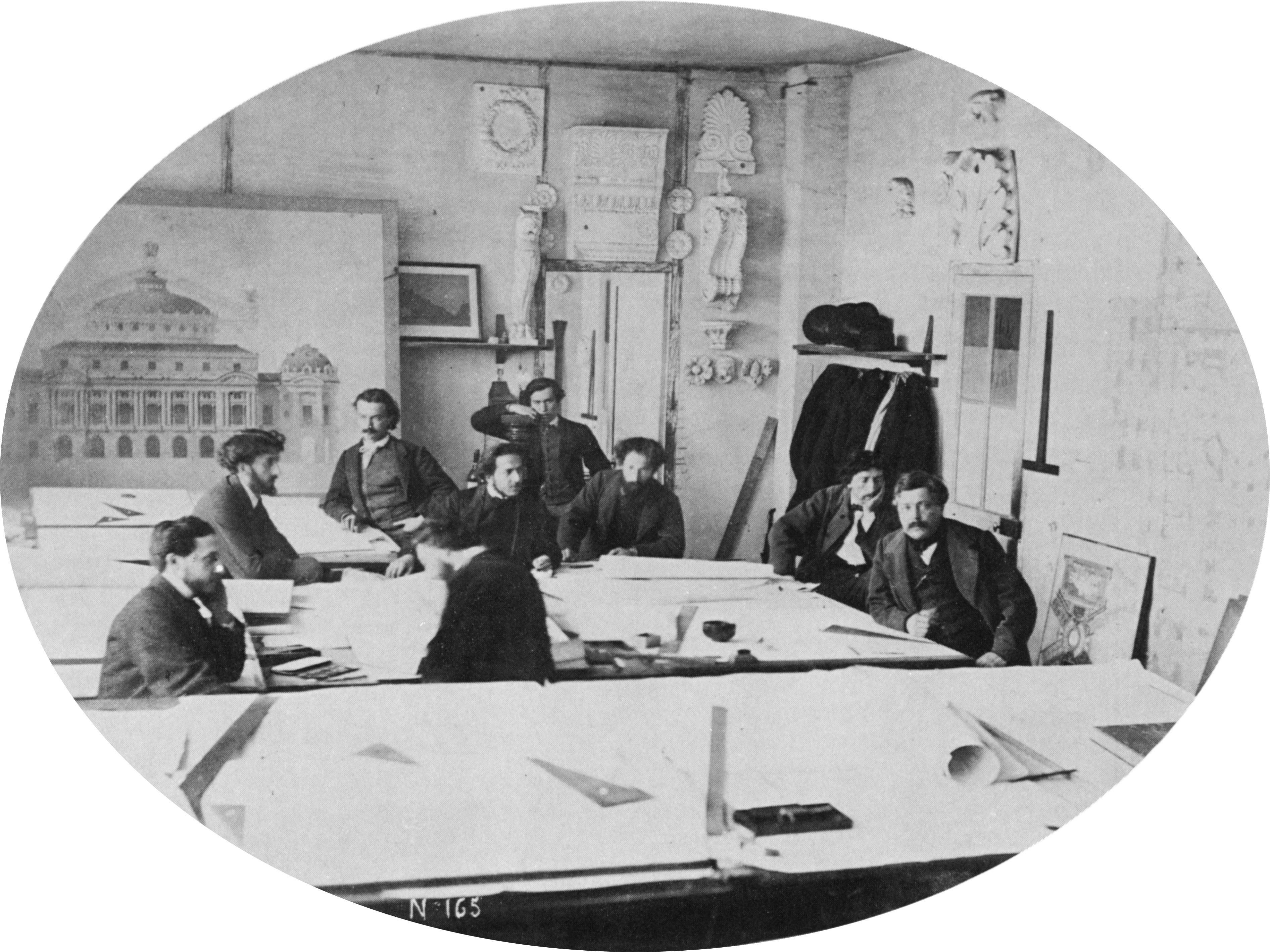
The first university architecture programs appeared in the late nineteenth century, at MIT (1865) and the University of Pennsylvania (1868). Previously—and for a long time thereafter—most architects in the English-speaking world learned their craft through apprenticeship, on the job, working in an office. Frank Lloyd Wright, Edwin Lutyens, Charles Rennie Mackintosh, Charles A. Platt, Horace Trumbauer, Ralph Adams Cram, and Bertram Goodhue are prominent examples. While it is still theoretically possible to become a registered architect through apprenticeship, in practice formal education has taken over the training of architects. How does one teach someone to be an architect? Since architecture is not a science, there is no underlying body of knowledge to absorb. Architects study precedents, but learning to design is like learning how to swim, you have to jump in the water. Hence, the studio system. Students are assigned building problems—simple at first, increasingly more complex—and develop solutions in drawings and models. These are evaluated by the teacher and invited “jurors”; the term is apt since student are required to “defend” their designs in public. The process is intended to simulate an actual building commission in the sense that there is a list of functional requirements and an actual building site, but the studio approach has severe limitations: drawings and models can only go so far in simulating reality; there is not enough time to develop details, so materials and construction tend to take a back seat; building costs are rarely considered. Above all, there is no client. As a result, while students imagine themselves to be architects, their view of architecture is very lopsided. Satisfying the client, meeting the budget, building on time, resisting the elements, and the challenging task of “getting the job,” in H. H. Richardson’s memorable phrase, are not considered to be a part of the design process.
Of course, all architects quickly learn these lessons—on their first job—and in that sense apprenticeship continues to be a valuable part of learning how to be an architect. But the studio experience has a bad effect: it leads to over-intellectualization of the profession. Talking, accompanied by obscure theories, jargon (usually borrowed from other disciplines), and strained analogies, takes the place of building. Lutyens, for one, saw this coming. “All this talk brings the ears so far forward that they make blinkers for the eyes,” he once observed.
THE LATEST
