FAKE NEWS
 The other day I read in The Architects Newspaper that the dean of IIT had stepped down. While this is undoubtedly of keen interest to IIT faculty and students why is it considered news? Perhaps because five years ago, when Wiel Arets was appointed dean, that decision was widely reported. But why was that event newsworthy? Architecture schools operate under a handicap where publicity is concerned. Law schools periodically gain attention when their graduates attain high positions, the Supreme Court or even the White House; business schools are lauded for the wealth of their graduates; and medical schools can announce the occasional cure for this or that. But architecture schools rarely conduct groundbreaking research, and when all is said and done the education of architectural professionals is a dull affair. Every year, year in and year out, a new group of graduates is sent out to stock the nation’s drafting rooms, and year in and year out a new cohort arrives at the door. Not much news there. Architecture schools attempt to promote exhibitions of their students’ work, but it is after all, student work, that is, the exercises of trainees, of little interest to the world at large. Which brings us to the appointment of deans and chairs—not big news in itself, but a change in the routine. Or perhaps news, if the name is recognizable, not an obscure academic, of course, but a globetrotting practitioner. In a culture driven by celebrity, that is sufficient to pass for news.
BELLS AND WHISTLES
 My first car was a Volkswagen. It was a 1960 model bought in Hamburg in 1967, and it carried me without a hitch as far as Valencia (which is where it was stolen, but that’s another story). I’d never driven a VW before, but the simple controls required no advance knowledge. The only gauge was a large speedometer that included an odometer, turn indicators, and two (unidentified) warning lights, one for oil pressure and one for the alternator/generator. A third warning light lit up when the gas tank was empty, which required flipping a switch to access the reserve tank (about a gallon, or 40 miles)—there was no gas gauge. There was no temperature gauge because the engine was air-cooled. In addition, the dashboard included two white pull-knobs; the left was for lights and the right for the windshield wiper. I think there was a choke knob somewhere.
I was reminded of my VW the other day when a friend offered my a ride in his new Prius. The digital read-outs of what Toyota calls the Multi-Information Display, covered a range of technical information such as low tire pressure and fuel consumption, and included such extraneous information as which door was open. Basically, the traditional gauges were replaced by a small computer screen, and like most personal computer screens, it was awash in icons, numbers, and information. Since the marginal cost of adding more information is minimal, I got the sense that the designers had simply piled on the bells and whistles. No doubt one gets used to it in time, but I would miss the minimalist elegance of my old VW.
IF IT AIN”T BROKE

Sholes & Glidden, 1873
Smart phones, iPads, and laptops are recent innovations, but their human interface is a Victorian technology that is almost 150 years-old. The QWERTY keyboard appeared first in an 1868 typewriter patent granted to Christopher Sholes, Carlos Glidden and Samuel Soule. The patent was acquired by E. Remington and Sons, a firearms and sewing machine manufacturer, and 5 years later, the so-called Sholes & Glidden, also known as the Remington 1, appeared. The machine was not perfect—it typed exclusively in caps, and the typist worked “blind,” that is, she could not see what she was typing since the keys struck the underside of the platen). Nevertheless it was a commercial success—Mark Twain was an early adopter and Life on the Mississippi became the first typewritten manuscript ever summited to a publisher.
Later typewriters added a shift lever that allowed upper and lower case typing, and solved the typing blind problem, but the QWERTY keyboard, said to be invented by Sholes, a Wisconsin newspaperman, remained (and remains today, slightly modified to meet the needs of different languages—QWERTZ in Polish). According to Martin Howard, whose collection of antique typewriters can be viewed on his website, the odd arrangement separated letters that were frequently typed together to avoid clashing of type bars. Thanks to the Remington 2, called the Model T of typewriters, the QWERTY keyboard, enjoying the first-mover advantage, became the de facto standard and resisted all efforts to replace it with alternative arrangements. Like the musical keyboard, which dates back to at least the fourteenth century, the QWERTY keyboard seems destined to endure.
COMMUNITY-ORGANIZER-IN-CHIEF
 According to a report in Politico, unlike all previous presidential libraries since FDR’s, the Obama “library” will not contain any presidential papers; the actual archives will be located elsewhere. This means that the building in Lincoln Park will not be owned and operated by the National Archives and Records Administration (NARA).
Why did Obama opt for this unusual solution? According to Politico, the rationale may have been financial. “If the Obama Center chose to include a “presidential archival facility,” the private Obama Foundation would be required to provide NARA with an endowment equal to 60 percent of the total cost to build and equip that facility for ongoing operation and maintenance expenses,” it reported. “For a library that has been estimated to cost more than a billion dollars, such a move could save hundreds of millions.” Or perhaps Obama simply preferred that control of the facility not pass to the federal government. The Obama Presidential Center, as it is to be called, is intended to function more like a community center than a traditional presidential archive-cum-shrine, which may be appropriate for the president who was the Community-Organizer-in-Chief.
Which brings us to the recently unveiled preliminary design. Like many Williams & Tsien projects, the centerpiece is a striking if somewhat mysterious form. It recalls a funerary urn. Is this meant to suggest that the building is a memorial to its subject? The press release that accompanied the design described the complex as “a recreational destination and center for gathering on the South Side for families, community members and visitors alike.” So what is it to be, a national icon or a neighborhood center? Squaring that particular circle will not be easy.
THE LAYERS OF THE PAST
 Ian Volner’s review of Robert A. M. Stern’s Museum of the American Revolution in Philadelphia is more even-handed that Inga Saffron’s mean-spirited screed in the Inquirer. But both critics miss an important aspect of Stern’s design: its relation to the nearby U.S. Custom House. That 17-story tower is the most prominent building in the area and provides a backdrop to the museum, evident in Peter Aaron’s evocative photograph. The museum echoes some of the brick and limestone details, as well as the crowning lantern. The Custom House, a WPA project completed in 1934, was the work of Verus T. Ritter and Howell L. Shay (Shay had worked for Horace Trumbauer, and is credited with the parti for the latter’s Philadelphia Museum of Art). The brick and limestone Custom House combined an Art Deco sensibility with Federal details and forms in a masterly way. Thus Stern’s museum, far from being latter-day Georgian revival, as both Volner and Saffron suggest, is really a twenty-first century interpretation of an early twentieth century take on American Federal, which itself was a version of British Georgian. Personally, I find the recessed arches of the museum’s facade to be a little heavy-handed, but the dialogue with the many pasts of Philadelphia is interesting and bears mention. Incidentally, Saffron suggests that there is something unseemly in using Georgian stylistic references in a building commemorating a war fought “to free ourselves from the Georgian tyranny.” But the Founding Fathers were not revolting against British civilization, only British rule; in architecture they were content to take their lead from their British cousins.
SLOW AND STEADY WINS THE DAY
 There is a long tradition of architectural research in structures—one thinks of Nervi, Candela, Torroja, and Frei Otto, the pioneers of concrete like Perret, and much earlier the Byzantine and Gothic builders. Architects have sometimes experimented successfully with new building techniques and materials (Rudolph invented striated concrete blocks; Foster was the first to use structural glass fins). But research into how people use buildings is rare. The profession has always recognized the value of so-called post-occupancy evaluation, and the need for knowledge based on how people actually behave in and use buildings. The problem has been that this kind of research is extremely complicated, time-consuming, and expensive. Moreover, it fits into practice with difficulty. There is no advantage to a practitioner in showing the long-term deficiencies of his design decisions. Negative feedback is merely embarrassing. There is a professional reluctance to “tell tales out of school” and to reveal clients’ confidences, or to suggest that what the client got was less than perfect. A scientist can publicly document experiments that failed without risk—indeed, that is the basis of the scientific method—but an architect’s reputation would suffer were he to do so. (I learned about this when I wrote The Biography of a Building, about the Sainsbury Center for Visual Arts.)
It would require a sort of unbiased consumer protection agency to do true post-occupancy evaluation. But who would fund it? Not the original designer, whose reputation can only be hurt. Not the client, who may be criticized for misuse of funds. Not the building industry, which may be legally liable for deficiencies. Not the current building owner who will only risk reaping bad pubicity. A government-funded consumer agency seems like a long shot in the current climate. The most likely areas for intensive research into human behavior in buildings would be focused on specific subjects of vital public concern: thermal comfort related to energy conservation, crowd behavior in building disasters, the health effects of healthcare environments.
What is the alternative? In the past, architects were relatively conservative when it came to innovation. Palladio researched archaeological ruins, and innovated in formal aspects of building, but the plans of his villas follow tried and true models. Architects based their work on a Canon—buildings that were considered exemplary and provided field-tested models. I have many friends who are “traditionalists” and “classicists.” What distinguishes their work from that of the self-styled avant-garde is that they tend to lean on historic precedent and traditional types for design decisions, rather than conjuring up novel forms and building arrangements out of thin air. This is true both in building design and urban design. Slow and steady wins the day.
ARCHITECTURE BRUT OR DEMI-SEC?
 Is every building made out of concrete automatically Brutalist? The answer is yes, according to a recent article on Habitat in the New York Times. But this is a gross over-simplification. Brutalism refers to buildings that dramatize the rough character of concrete. Paul Rudolph’s striated Art and Architecture Building (1963) at Yale is the preeminent example. The roughened concrete is used throughout the building, inside and out. The A & A exhibits another quality of Brutalism—it’s monumental. But not all architects who exposed concrete were striving for this quality. Pier Luigi Nervi, for example, built exclusively in concrete but gave the material a smooth, sculptural quality that is anything but brutal. I. M. Pei’s Society Hill Towers in Philadelphia use a poured-in-place concrete facade that is similarly plastic, smooth surfaces with rounded corners. Many architects went to great lengths to make precast elements that were machinelike and precise, not qualities generally associated with Brutalism. (The glassy concrete of Piano and Ando today is likewise non-Brutalist.) The precast concrete of Philip Johnson during his neo-classical period is almost delicate. Which brings us to Habitat. It is all exposed concrete on the exterior, since the boxes were precast in a factory, although great efforts were made to make the material as smooth and blemish-free as possible. (At one point the option of building the project out of steel was considered.) Safdie used concrete not because he was seeking a rough and monumental aesthetic, but because he wanted to show how prefabrication could be used to make mass housing. There is another litmus test of Brutalism. Buildings like Habitat remain popular with their users. If people don’t hate it, it can’t be Brutalist.
THE FINAL WORD
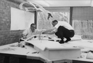
Eero Saarinen and Kevin Roche with model of TWA, 1957
“Dwelling narrowly on the legacy of designers gives the impression that architectural history concerns great men, not great places,” writes Lance Hosey in the Huffington Post. Hosey was commenting on an essay that I wrote recently in Architect, in which I speculated about what might have happened if certain celebrated unbuilt projects had actually been realized. It is fashionable to think that architecture is not the creation of great men—or great women—but is it true? Does anyone really believe that the spirit of Louis Kahn did not manifest itself in his designs? When he died, that spirit died with him. When Eero Saarinen died, Kevin Roche and John Dinkeloo continued the practice, but Saarinen’s mercurial creativity was absent. The art of building is a peculiar art that relies on team work—in that sense it resembles film-making rather than novel-writing. But as in film-making, the auteur is often present. I remember working for Moshe Safdie in the 1970s. There were a dozen or so people in the office, but when Safdie was away, a certain inertia set in as people waited for him to return and make decisions. The decisions might concern alternatives developed by someone else, but there was never any doubt about who would have the final word.
HIGH TECH 0, LOW TECH 1
 Norman Foster is building an office building in downtown Philadelphia. The Comcast Innovation and Technology Center, a 1,121-foot skyscraper, will be the tallest building in the city. Passing by the other day, I noticed elevator cabs scuttling up and down the side of the building. They reminded me of the external elevators on the Pompidou Center in Paris. Typical High Tech detail, I thought to myself, before I realized that these were construction elevators. The actual core is deep inside the building in the conventional fashion. And unlike Foster’s Hongkong & Shanghai Bank building, the structure is concealed as well (except for a vestigial expression of cross bracing on the otherwise pristine glass facade). Like almost all contemporary office buildings, in fact like almost all buildings of any kind today, this is a glass box. How times have changed! The truth is that the exposed structure and plumbing and ductwork that characterized High Tech architecture never made much sense. It weathered badly, for one thing—the Pompidou Center required an expensive facelift after only 20 years. The goal of infinitely adaptable architecture didn’t make sense either. The time-tested way to adapt is not to change a building but to move to another one. In 2014, the London Sunday Times reported that Lloyd’s was considering moving out of its headquarters building. It had already relocated a quarter of its operations to less expensive premises, and was subletting the space. The newspaper quoted Lloyd’s chief executive Richard Ward: “There is a fundamental problem with this building. Everything is exposed to the elements, and that makes it very costly.” Lloyd’s did not move, but it did sell the building to a Chinese insurance company (at a steep mark-down because of the inside-out design), and now leases space. So much for adaptive architecture. High Tech 0, Low Tech 1.
SPECIAL CHAIRS
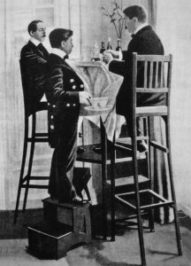 Isabella Lobkowicz kindly sent me a copy of her recent book, Almost 100 Chairs for 100 People. “It’s curious how many designers design chairs,” she writes in the Foreword, “but nobody seems to think about the characters who are going to use them.” Princess Isabella (she is married to a Bohemian prince) rectifies this situation with a delightful sketchbook—published by Moleskine—of imaginary chairs. The first, “a chair for the explorer,” is an extremely tall chair with a built-in ladder that allows the occupant to scan the vicinity with his ever-present binoculars. This chair reminds me of the tall chairs made by the pioneering balloonist and aviation pioneer, Alberto Santos-Dumont (1873-1932). Santos-Dumont held what he called “aerial dinner parties,” and the chairs were intended to give his guests the experience of flying, that is, seeing the world from above. He made the chairs himself, being a skilled craftsman (he built his own flying machines). Santos-Dumont was an unusually innovative character. Finding checking his pocket watch awkward while flying, he asked his friend Louis Cartier to make him a more convenient timepiece—the result was the first wristwatch.
THE LATEST
