TOPPERS
by Witold | May 27, 2018 | Architecture
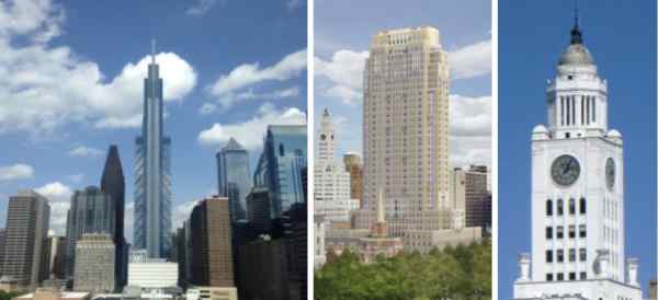
The Comcast Technology Center (Foster + Partners) in downtown Philadelphia is nearing completion. It’s not open yet, but its impact on the skyline is already apparent. Meh. The most that can be said about it is that it recalls a De Stijl composition of overlapping boxes. But the glass boxes—the building is all glass, of course—lack refinement and look as if a preliminary concept sketch had been rushed into construction. The clumsiest element is the optimistically named “lantern.” There are many interesting skyscraper tops, such as the mooring mast atop the Empire State Building, or the Chrysler Building’s Art Deco spire, but the illuminated Comcast top only looks good at night (like most all-glass buildings). During the day it is a dud, an awkward prism.
The 34-story Alexander tower (Robert A. M. Stern Architects) is much more successful. Although a local architecture critic scoffed at the “wedding cake” design, the nice thing about a wedding cake is that the design supports an interesting top. The Alexander doesn’t make a big deal of its top, but it steps back subtly in an interesting way and is surmounted by a sort of laid-back Mayan temple. Just to the left in the photograph you can see a building from the golden age of skyscraper design, the Elverson Building (Rankin, Kellog & Crane), built by the Philadelphia Inquirer in 1924. The pinnacle is an octagonal temple with a golden dome, a memorable topper for a building housing the city’s main newspaper, when urban daily newspapers were still important. I suppose that, in that sense, the banal Comcast Center suits a corporation that owns the company that created Days of Our Lives and America’s Got Talent.

CRITICS AND CRUSADERS
by Witold | May 25, 2018 | Architecture
The Architects Newspaper recently asked a number of critics, academics, and architects “What do you see as the role of the critic in architecture today? Why is it important? What aspects of architecture are not being addressed today by critics?” and “What are the problems with criticism today?” Weighty questions that produced, in most cases, weighty—and lengthy—answers. You can judge for yourself. One of the more insightful comments was that of Frances Anderton, the British host of a weekly Los Angeles design and architecture radio show. “It was easier to be a critic when you were crusading for modernism, or another -ism, from a podium at a highly-regarded publication,” she observed. The pioneers of this mode were Allan Temko at the San Francisco Chronicle (1961-93) and Ada Louise Huxtable at New York Times (1963-82). They were preceded by Lewis Mumford at the New Yorker (1934-1960s), although his relationship to modernism was often equivocal. There had been earlier architecture critics, of course. Montgomery Schuyler wrote for the New York Times (1883-1907) and Mariana Griswold Van Rensselaer’s essays appeared in Century Magazine and Garden and Forest, and both had championed individual architects such as H. H. Richardson and Frederick Law Olmsted. But the crusader-critics’ role was different: not to analyze but to persuade an often skeptical public of the virtues of modern architecture. The crusading function was adopted by their successors, but became strained as modernism became less of a cause and more of a style, in Nathan Glazer’s words. Criticism came to sound increasingly like an architectural version of People magazine. “I’ve always thought that journalistic architectural criticism was an odd bird,” I told The Architects Newspaper. “Compared to restaurant, book, or theater reviews, reviews of buildings have little immediate effect on the public. Once a building is built, it’s there, for better or worse, and we must learn to live with it.” Not that one can’t write about architecture. “Buildings last a long time, and it’s useful to reflect on their utility—what works and what doesn’t—and their meanings in our lives. Of course, this is best done in the fullness of time, decades after the building opens, when the sharp corners have been knocked off, so to speak. The result is more like cultural observation than reporting.” Or crusading.
Photo: Mariana Griswold Van Rensselaer, from a plaque by Augustus Saint-Gaudens
WRIGHT WAS RIGHT
by Witold | May 19, 2018 | Housing, Modern life
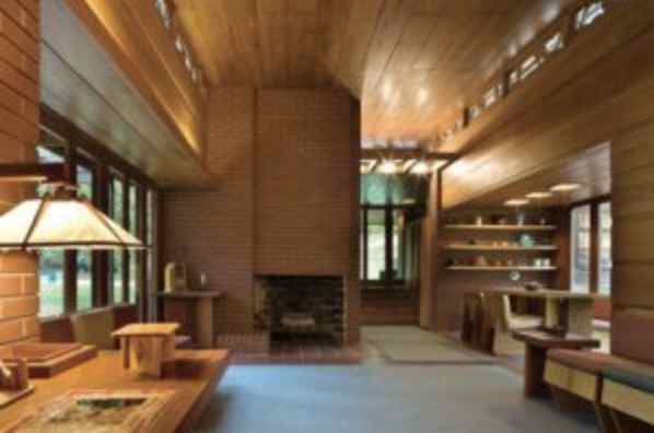
Ian Bogost’s excellent Atlantic article on the fashionable open plan, which integrates the kitchen into the main living spaces of the house, points out the drawbacks of this arrangement: leaving a messy kitchen open to full view, which can be awkward when entertaining. Bogost correctly credits Frank Lloyd Wright with popularizing the open plan, but he doesn’t point out that in Wright’s Usonian houses, the kitchen—which he called the workspace—is generally positioned out of view of the living room. In this photograph of the Pope-Leighey House, a small Usonian built in 1941 in suburban Virginia, the compact kitchen is unobtrusively tucked in behind the brick wall containing the fireplace. Conveniently opposite the dining area, but out of view. This arrangement is vastly superior to the modern practice of exposing the kitchen as if it were a stage set, which, with all those expensive stainless steel “commercial” appliances prominently on display, I suppose it is.
Incidentally, the Pope-Leighey House now sits on the grounds of Woodlawn Plantation in Alexandria, Virginia and is open to the public.

TOM WOLFE (1930-2018)
by Witold | May 16, 2018 | Architecture
The first time I heard Tom Wolfe speak in public was in 1965 or ’66. I was a student at McGill University where he had come to lecture. One line has stuck in my memory; he compared himself to the “renegade cowboy,” the character in Western movies who has lived with the Indians and who comes back to town to tell the tale. I knew Wolfe’s writing from reading him in Esquire, and The Kandy-Kolored Tangerine-Flake Streamline Baby may have been out by then. I remember From Bauhaus to Our House (1981) which came out first as an article in Harper’s (July 1981). By then I was working on minimum cost housing research, somewhat estranged from high architecture, so I had no objection to his mocking tone. I had not yet experienced the epiphany that came from writing Home, but I thought his take on the Modern “revolution” rang true. I still do. Judging from Twitter, From Bauhaus to Our House still rankles architecture critics, as it was intended to do. How could someone not admire the Seagram Building? Almost 40 years later, as Yale University spends half a billion dollars building two Gothic Revival colleges, Wolfe’s critique of Modernism seems more prescient than ever.

PRESERVATION
by Witold | May 14, 2018 | Architecture, Modern life
Why do we renovate, restore, or otherwise preserve old buildings after they have become functionally obsolete? One reason is practical—the building is in good enough shape to be still useful, even in an altered state, or for a different purpose than originally intended. The second reason is cultural. Perhaps the building was once the home of an important figure—Mozart’s house in Vienna, for example, or Washington’s Mount Vernon—or maybe it was the site of an important event such as the signing of the Declaration of Independence. The third reason is aesthetic: the building is beautiful and incorporates artistry and craftsmanship that have made it the object of our affection. This applies to grand monuments, but also to buildings of lesser ambition; there are entire neighborhoods that represent important human achievements. What seems to me a less compelling reason is the idea that a building should be preserved simply because it is representative of a previous period or architectural fashion. In architecture, as in many human endeavors, not all periods are equally admirable; there are ups and downs. I do wish that masterpieces such as Richardson’s Marshall Fields Wholesale Store, McKim’s Penn Station, and Frank Lloyd Wright’s Larkin Building had not been demolished, but I would not miss Josep Lluís Sert’s banal university buildings in Cambridge, or Pietro Belluschi and Walter Gropius’s hulking PanAm (today MetLife) Building. Nor would I object if, in the future, some of today’s more egregious urban intrusions were slated for the wrecker’s ball.

A MAN OF INFLUENCE
by Witold | May 11, 2018 | Architects, Architecture
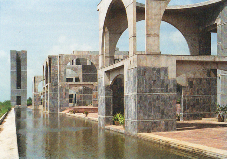
“But an influence is not necessarily a good influence” writes Joan Acocella in a review of books about Bob Fosse. She’s right, of course. How often we describe an architect as influential, without qualifying the nature of that influence. Probably the most influential American architect of the late nineteenth century was H. H. Richardson—Richardsonian Romanesque libraries and courthouses grace cities and towns across the country. It’s hard to go wrong with this style. The only modern architect to give his name to a style was Mies van der Rohe, but his legacy is less certain. In the hands of faithful acolytes like SOM, the influence could be benign, but the scores of banal steel-and-glass boxes and miles of appliqué I-beams attest to the limitations of the minimalist Miesian approach. Michael Graves was another architect whose influence was not necessarily “good.” Without his refined color sense and knowledge of history, postmodern practitioners produced parodies—weak jokes without punch lines. Louis Kahn was the most important modernist architect of the late twentieth century, but his influence on American architects was negligible; his “philosophy” was too obscure, and his building forms too distinct to comfortably imitate. Or at least so it seemed to me before I visited India. Indian architects who either studied with him (like Anant Raje), or worked on Kahn’s Indian Institute of Management project (like Raje and B. V. Doshi), adopted him as a guru, absorbed his mystic pronouncements, and produced projects that are not copies of previously built work but look as if they might have been designed by the master.
Photo: Indian Institute of Forestry, Bhopal (Anant Raje, 1984)
FUTURE SHOCK
by Witold | May 8, 2018 | Architecture
One of the first buildings expressly intended to grow was the main library of the University of Pennsylvania, which opened in 1891. Frank Furness designed a head-and-tail building, with a magnificent four-story reading room as the head, and the stacks as an ever-expanding tail. The three-story stacks housed 100,000 books, but the end wall was removable so that the stacks could be extended, bay by bay—up to three times their length—increasing their size and capacity. Furness was correct about the need to accommodate more books, but he was wrong about the expansion. In 1915, the university erected an unrelated building on the site of the future stacks, effectively blocking his long-sighted vision. This has been the fate of many such future-oriented designs. It isn’t that buildings aren’t added on to, but the additions are generally ad hoc, not following any predetermined plan. This was even true in the 1970s, when architects were fascinated by the idea of growth. Norman Foster’s Sainsbury Centre for Visual Arts was a linear shed intended to grow at either end, but when the building was expanded (by Foster!) it ignored this strategy and went underground instead. I think the problem is a combination of practicality and hubris. On a practical level, it’s difficult for an architect to correctly envisage future needs. How could James Hoban and his client George Washington predict a White House staff so large that it would require a West Wing? Or how could a nineteenth-century museum designer imagine cafeterias and gift shops? In any case, architects and their clients are generally loathe to be constrained by the plan of some long-dead predecessor; they have their own ideas. So perhaps it’s best to design for today, and let the future take care of itself.
Photo: Library, University of Pennsylvania, expandable stacks on the right

DESIGN AND RESEARCH
by Witold | May 5, 2018 | Architecture, Design
A recent article in Architect quoted Jérôme Chenal, a Swiss architecture professor: “Design is not research, that is just speculation . . .” Exactly so. For years I have heard design studio teachers maintain that what they do with their students qualifies as research, and that it is an injustice that it is not recognized by the rest of the university as such. But Chenal is correct, design is speculation, not research. There is no real feedback. I suppose if a design were built and evaluated it might qualify as a sort of research, but studio work remains on paper—or, rather, on the screen. Feedback, in the form of the comments of critics, is a function of taste rather than performance data. The same is true in the profession. The practice of architecture is ill-suited to research—clients do not expect to pay for experiments, they want buildings that work. This is not to belittle design, but rather to distinguish it from research. When Charles and Ray Eames laboriously developed a technique for heat-forming wood laminations into three-dimensional shapes, that was research. When they produced the DCM chair, the “potato-chip chair,” that was design.
OUR SHINY FUTURE
by Witold | May 2, 2018 | Architecture
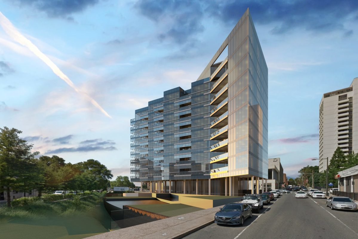
I attended a neighborhood association meeting last night to hear about a proposed apartment building: 2100 Hamilton Street in the Benjamin Franklin Parkway area of Philadelphia. The “review” was a matter of courtesy on the part of the developer since he had just received his building permit from the city. The animated questions from the audience concerned practical issues: how would traffic be handled, would the building block views, would the developer repair the broken sidewalk, where would visitors park. In truth, the 10-story condominium with only 33 units would not be a major burden on the neighborhood. Sadly, nor would it be much of an adornment. The nineteenth and early twentieth century residential architecture of downtown Philadelphia is a rich visual feast that provides many pleasures to the passerby, whether the building is a modest rowhouse, an apartment building, or a renovated factory. The richness is a result of the materials and ornamental details: a decorated door surround, a cast-iron curlicue, a fanciful gable. 2100 Hamilton Street exhibits none of these features. Briefly put, like almost all new buildings in downtown Philadelphia, it is a glass box. Nothing but glass, except for some rather grim metal panels on the north side. “Ornament is a crime,” in the Modernist lexicon, so the glass box, which does away with not only ornament but also detail, is perfect. In a sense, such buildings are like large vehicles—in this case a Lexus, as this is luxury housing—parked on the street. There were no questions from the audience last evening about the building’s appearance. I suppose we are becoming accustomed to this shiny new vernacular. Or just resigned.
Photo: 2100 Hamilton Street, Cecil Baker & Partners, Architects
HE SAID, SHE SAID
by Witold | Apr 27, 2018 | Architects, Housing
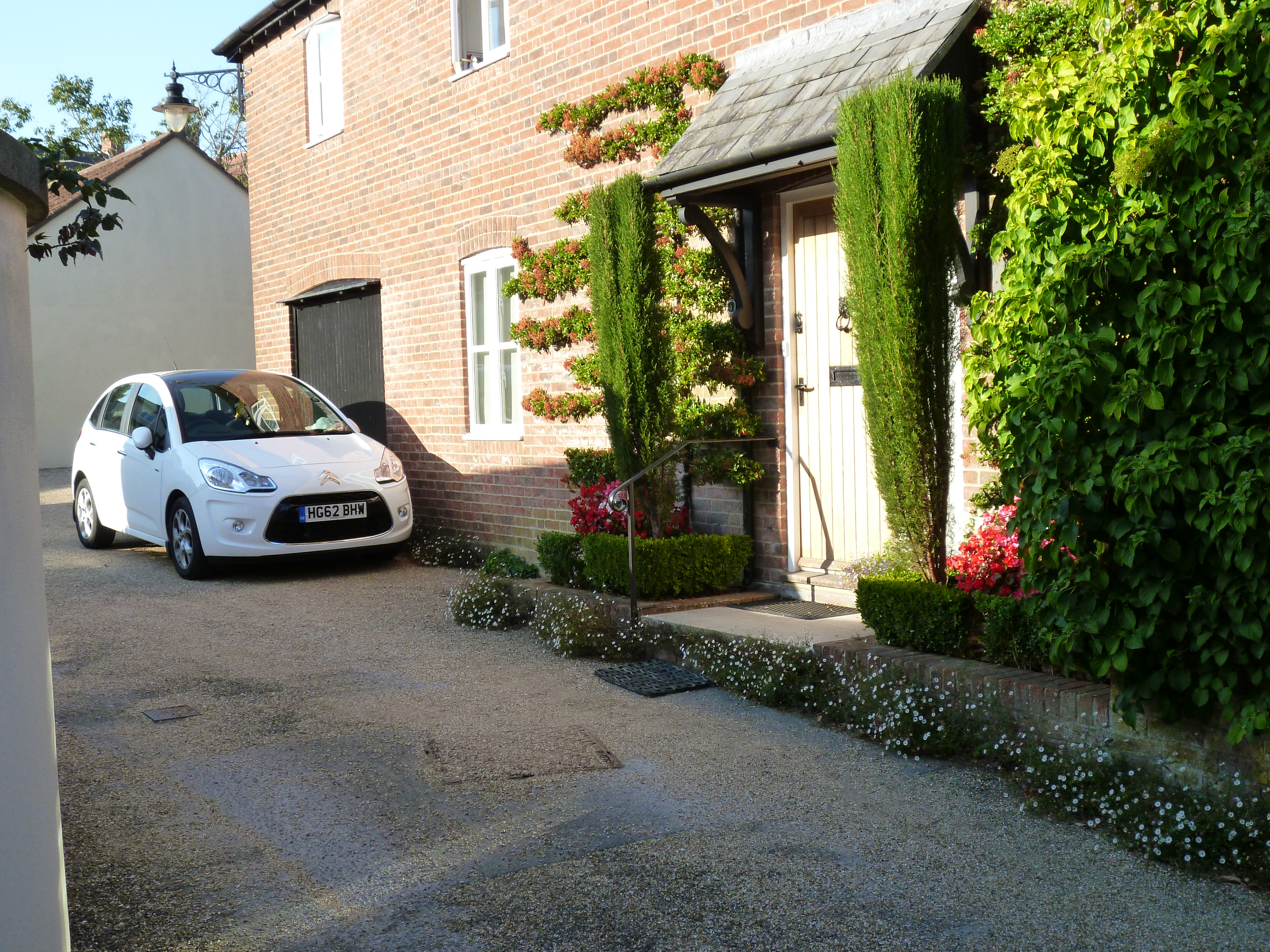
The finding of a recent online poll by AJ contrasts the views of architects (about a third of the respondents) with those of the non-professional public. The participants were shown images of housing, some traditional, some Modern. The public favored the former and the professionals the latter. In itself, a disconnect in opinion is not unexpected; trained professionals might appreciate attainments that are not immediately obvious to the unskilled eye. But the difference here was not one of nuance, what the architects admired was actually held in low esteem by the non-architects, and vice versa. “To the best of our knowledge the ‘winners’ of our poll (some houses in Poundbury) have not won any architectural awards; indeed they are widely reviled by the profession. The two losers have won nine between them.” The AJ article also describes an earlier—more structured—survey. “A group of volunteer students were shown photographs of unfamiliar people and buildings and asked to rate them in terms of attractiveness. Some of the volunteers were architects; some were not. As the experiment progressed, a fascinating finding became clear: while everyone had similar views on which people were attractive, the architecture and non-architecture students had diametrically opposed views on what was or was not an attractive building.” The research referred to was conducted in 1987 by David Halpern. His conclusion, according to AJ? “Professionals are, empirically, the very worst judges available of what people want or like in the built environment.”
Photo: Housing in Poundbury (photo by author)
THE LATEST
